Petfinder is an online, searchable database of animals who need homes. It is also a directory of nearly 11,000 animal shelters and adoption organizations across the U.S., Canada and Mexico. Organizations maintain their own home pages and available-pet databases.

The PetFinder mobile application was in need of user experience improvements to provide a more enjoyable and intuitive user experience for users. The goal of this task was to conduct a heuristic analysis of the PetFinder app to identify areas for improvement and prioritize these improvements to provide the most impact for users.
Conducted a heuristic analysis of the mobile application, using Jakob Nielsen's 10 Usability Heuristics as a framework. Evaluated the application against each heuristic to identify usability issues and potential improvements. Conducted further user research to validate the findings and gather additional insights. Prioritized the user experience improvements based on their impact and feasibility.
The design process for this project involved conducting a thorough evaluation of the PetFinder app using established principles of good user experience design. The results of the evaluation were used to identify areas for improvement and prioritize these improvements based on their potential impact on the user experience.

The design team at Petfinder was facing issues with inconsistent design language, miscommunication, and inefficient workflows, leading to slow project completion times and subpar design quality. The goal of this project was to develop a Figma boilerplate template file and enhance team communication and workflow to improve project efficiency and design quality.
To solve these problems, a Figma boilerplate template file was created to provide a consistent design language for the team to use. A set of guidelines and best practices were also established to enhance team communication and streamline workflows, improving project efficiency and design quality.
The design process for this project involved researching and analyzing the existing design language, communication methods, and workflows of the design team. Based on this analysis, a Figma boilerplate template file was created to provide a consistent design language, and guidelines and best practices were established to enhance team communication and streamline workflows.
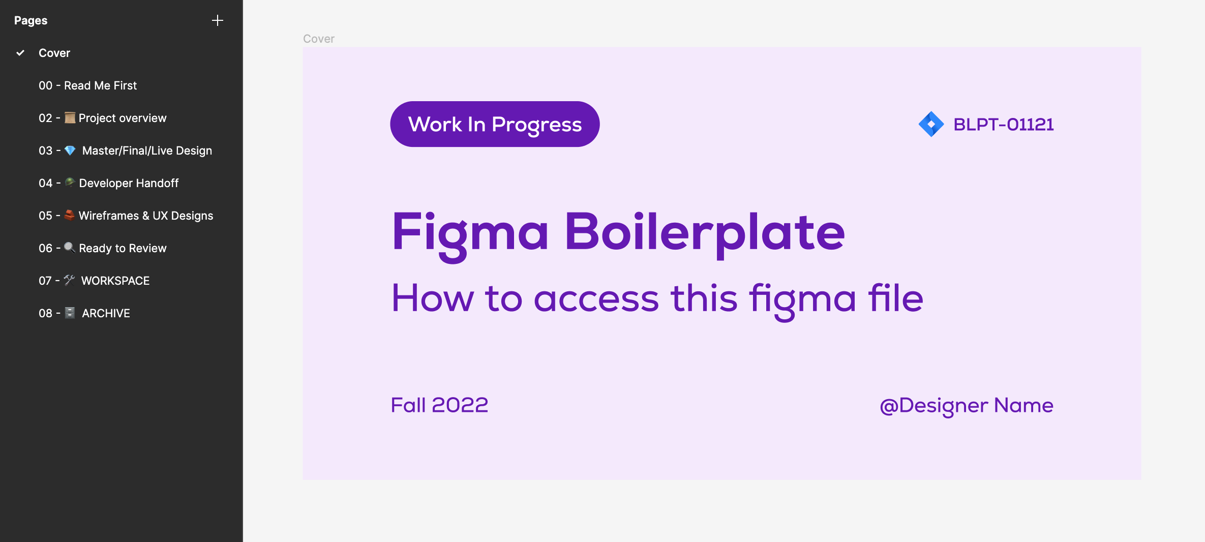
The template file and guidelines were tested and refined through multiple rounds of user testing and feedback from the design team to ensure that they were effective and easy to use.
This is the first page that all stakeholders should review. Stakeholders will be instructed on how to explore and collaborate on this file in this phase.
All project information and resources, such as Jira tickets or any other brief, should be described and linked.
The one and only "source of truth" for the entire figma file. All team members can see the most newest compositions here.
Describe what developers/programmers should begin implementing. Work with your developer to determine what documentation is required to put your ideas into practice.
User flow, wireframes, or high fidelity design are all legitimate here. Demonstrate the process to someone and document the discussion. As you engage in some conversation, this page may fill up quite quickly. To keep this page simple to navigate, be sure to only display the important information.
These resources are prepared for review. Organize assets new to old. Maintain the most recent exposure on this page so that it is available for review. Work with manager to organize and handle feedback.
Start the preliminary work in this section and rapidly develop something to share and discuss.
It is usually wise to archive work rather than erase it.
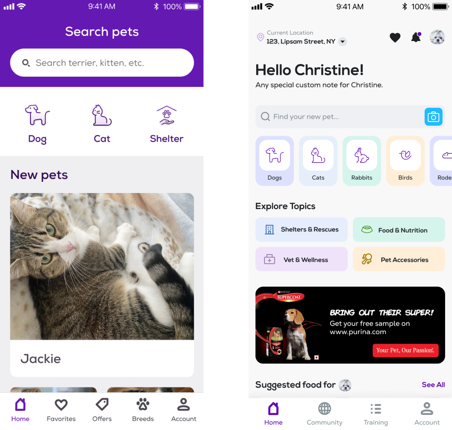
The PetFinder mobile app is a platform for pet adoption, but the original home screen and flow of the app was cluttered and confusing for users. The goal of this project was to improve the user experience by redesigning the home screen to show pets based on users' preferences, pet food recommendations, nearest shelter houses for pets, pet vet services, and optimizing the entire application flow.
To solve these problems, the home screen was completely redesigned to provide users with a personalized experience based on their preferences. The screen now showcases pets that match the user's preferences and provides pet food recommendations, the nearest shelter houses for pets, and pet vet services in their area. The flow of the app was also optimized to provide a more intuitive and user-friendly experience.
The design process for this project involved user research and testing to understand what users were looking for in a pet adoption app. The initial design was created based on this research, and multiple rounds of user testing were conducted to refine the design and ensure that it was easy to use.
The PetFinder mobile app was in need of a dark mode option to provide users with a more comfortable and visually appealing experience when using the app in low-light environments. The goal of this project was to design a dark mode for the PetFinder app that met the needs of users and was visually appealing.
To solve this problem, a dark mode was designed for the PetFinder app that was visually appealing and met the needs of users. The dark mode used a color palette and visual design that was optimized for low-light environments, making it easier and more comfortable for users to use the app in these conditions.
The design process for this project involved researching and analyzing the needs of users and best practices for dark mode design. Based on this research, a color palette and visual design were created for the dark mode that were optimized for low-light environments. The dark mode was then tested and refined through multiple rounds of user testing and feedback to ensure that it met the needs of users and was visually appealing.
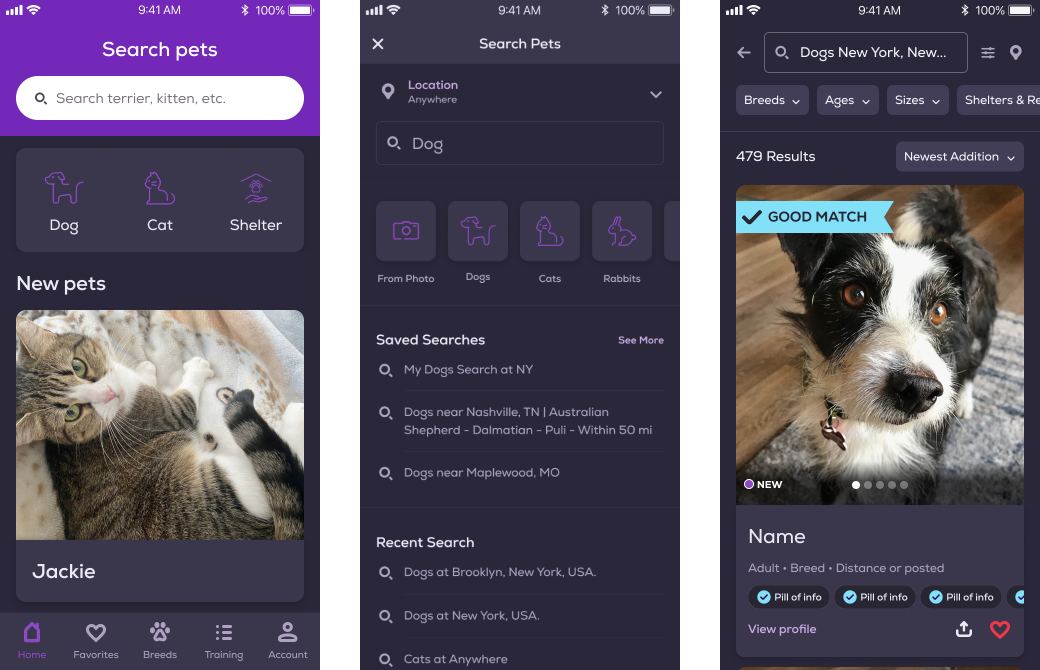
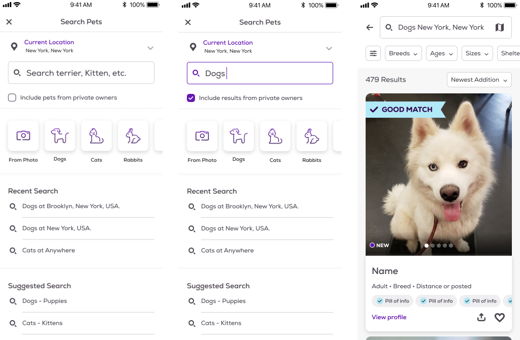
The PetFinder mobile app is a popular platform for pet adoption, but users were struggling to find the pets they were interested in due to the outdated and cluttered search screen. The goal of this project was to improve the user experience by redesigning the search screen to make it more user-friendly and intuitive. I worked on changing the search page which improved user interaction by 12%. The search page options and results were segmented in a way that helped users to scan through easily and more effectively.
To solve these problems, the search screen was completely redesigned with a focus on simplicity and ease of use. The number of filters was reduced, and the interface was streamlined to make it easier for users to find what they were looking for. The search screen was optimized for mobile devices to provide a better user experience for those on-the-go.
The design process for this project involved user research and testing to understand what users were looking for in a pet search app. The initial design was created based on this research, and multiple rounds of user testing were conducted to refine the design and ensure that it was easy to use.